Client: The Metropolitan Museum of Art
Team: Pratt Institute Usability Theory Students (Sarah Geiz and Conner Meek)
Role: Unmoderated User Testing, Qualitative Data Analysis, Mockups for Online Collection Filtering, Client Report
Timeline: 3 weeks, March 2024
The Challenge
The Metropolitan Museum of Art in New York City aimed to improve its online art collection to draw in more casual art browsers - people who have a general art or art history interest or those who visit the website without a specific piece or question in mind.
The Process
The Objective
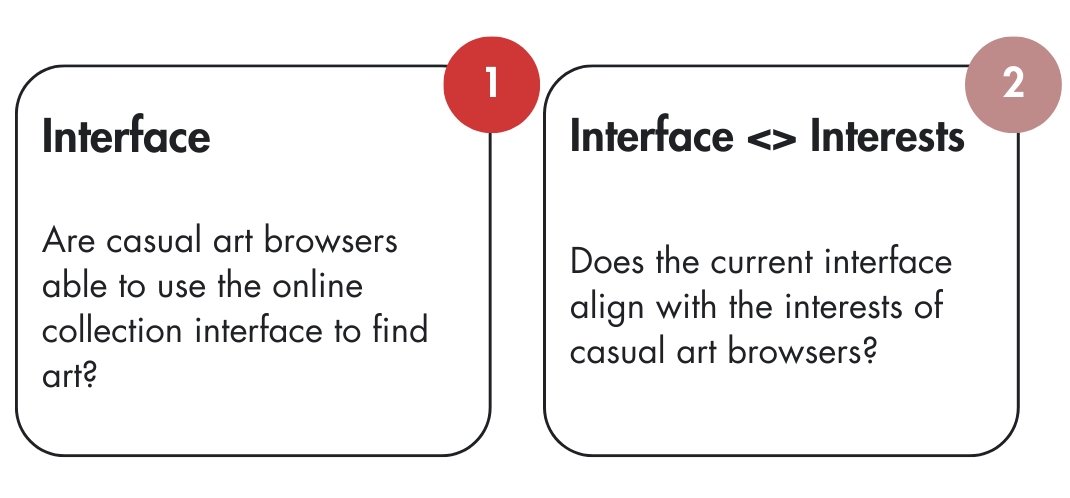
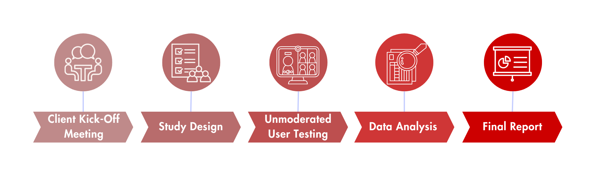
Study Design
To reach "casual art browsers”, we created a screener to identify interest in art as a topic and level of experience, aiming for those with little to no formal experience with art.
Users were recruited via usertesting.com, where all users are 18+. If they pass the screener, they are led to the test.
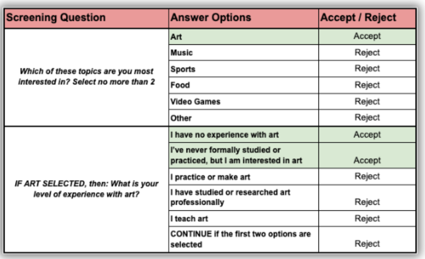
User Testing Screener
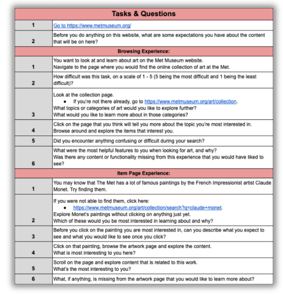
Testing Tasks and Questions
The test included questions about users' expectations before entering pages as well as tasks on the collection page and individual art piece pages.
Tests were recorded and users were asked to think out loud as they went through each question.
Participants
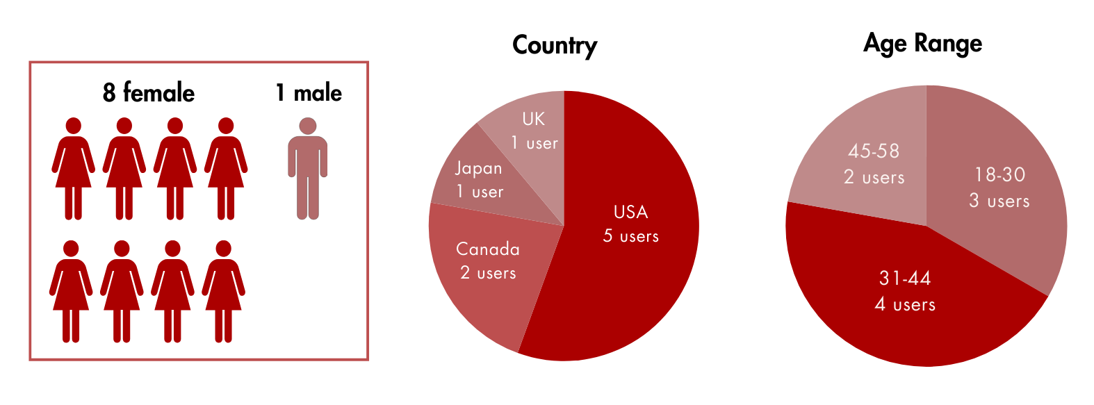
Participant Breakdown by Sex, Country, and Age
3 participants encountered technical difficulties in the search feature that blocked them from completing item page tasks.
The Big Picture
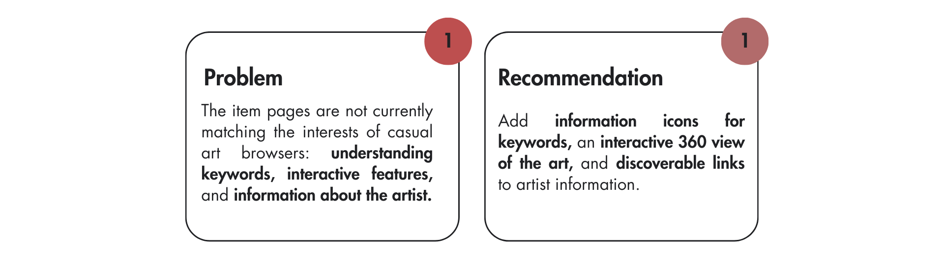
We analyzed our data from testing and discovered that all users felt the interface was easy to use, but they wanted more from the information.

Proposed Solutions
We developed targeted solutions to address specific issues on the collection page and item pages.
My role was centered around the collection page insights and solutions.
Art Collection Page

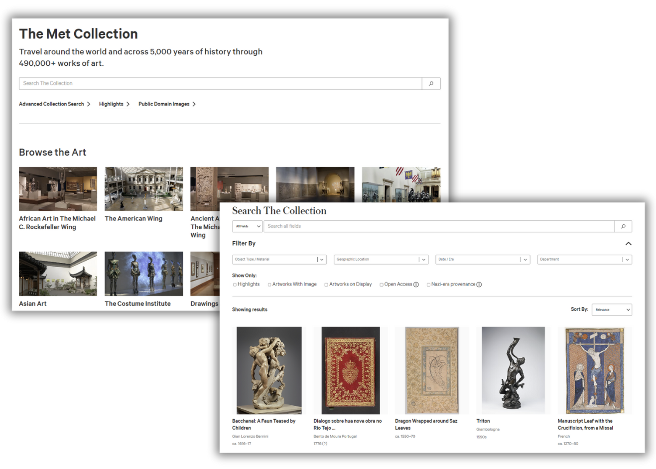
Previous Met Online Collection Page

Redesigned Met Online Collection Page
The redesigned page would include the ability to choose more categories than just museum departments.
Information icons are included if definitions are necessary. Users can also select "Show All Art."
Users can select multiple categories, and click Next. A dropdown will appear to allow users to filter.
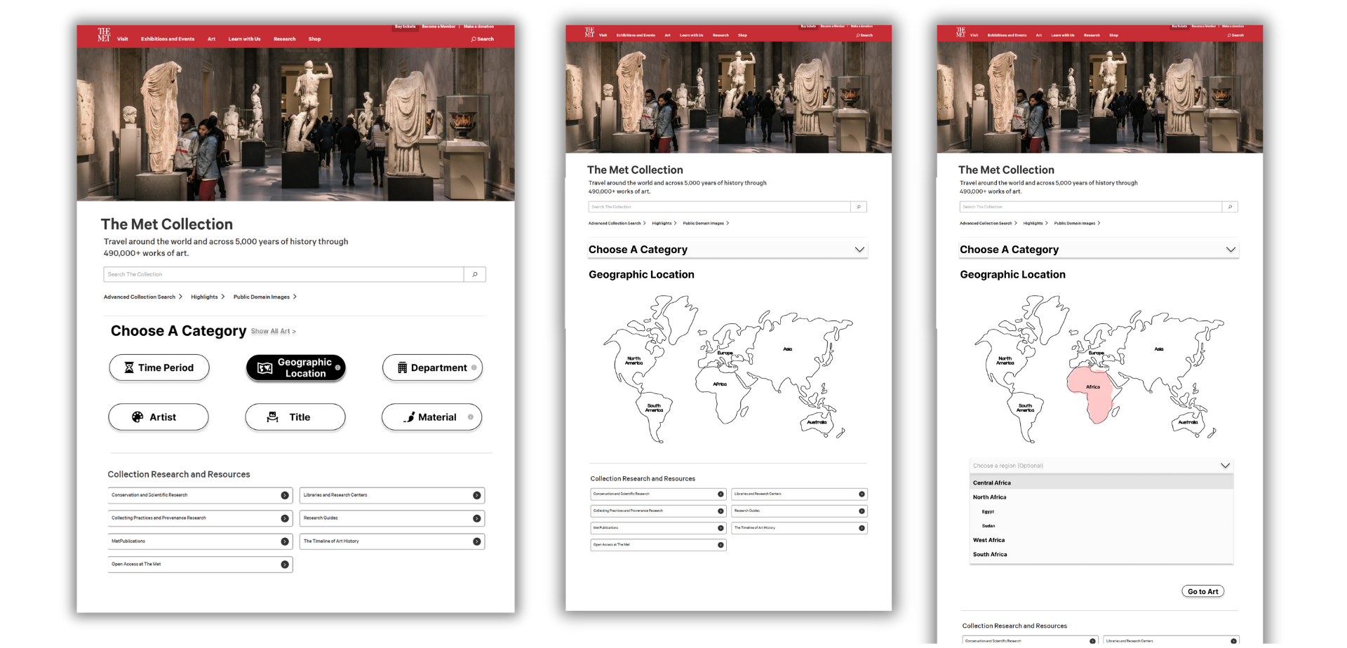
Example of filtering by geographic location. Region is optional.
If a user selects multiple categories, a more general category (one of the top 3) will appear first. The following categories will be shown filtered throughout the process.
If Africa is selected, for example, the next category would be artists, materials, titles, etc. in Africa only.

Example of filtering by artist
After the user selects Go to Art, they are taken to the online collection page.
Art Item Page

Previous Artwork Details section on the item page
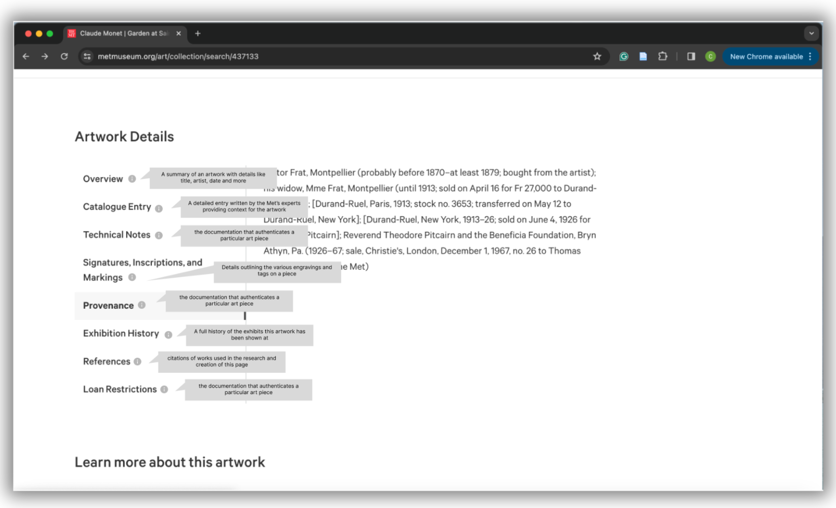
Redesigned Artwork Details section with examples of all descriptions
The updated “Artwork Details” section of the item page can include subtle yet effective descriptions for each section. Users can hover over the “i” icon to the left of each section to see descriptions.
Only one description can be shown at a time, providing an intuitive experience.

Previous art item page
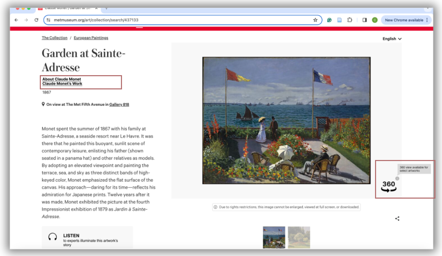
Redesigned art item page links and 360 view feature
The redesigned item page includes an “About [insert artist’s name]” link, in this case “About Claude Monet” that directs users to the artist's “essay” page. The Met currently uses the essay page and provides users with more information on the artists. However, this is only available for artists with an essay page.
The redesigned item page also has an “Artist’s Work” link, in this case, “Claude Monet’s Work” link, which directs users to the search page with Claude Monet’s work auto-populated. This is where the current “Claude Monet” link leads.
A 360 view feature is added, which will allow users to see the art in a 360 perspective inside the museum, and feel engaged with it.
Delivering Insights
Deliverable
1) Unmoderated user testing report with detailed findings
Future Considerations
1) Expand research to more casual art browsers.
2) Conduct usability testing on the redesigned mockups.
Thanks for going through my case study!