Client: Marine Park Alliance
Team: Pratt Institute Information Architecture / Interaction Design Students (Sarah Geiz, Rohan Boda, Tiffany Hatzidimitriu, and Jiten Thakkar)
Role: Interviews, Card Sorting, Tree Testing, Data Analysis, Desktop Donation Flow Prototype, Client Presentation
Timeline: 4 months (September - December 2023)
The Challenge
The Marine Park Alliance (MPA) wanted to enhance its online presence to engage its community and get more donations. However, their existing website suffered from disorganized navigation, hard-to-find tabs, and inaccessible color contrast ratios.
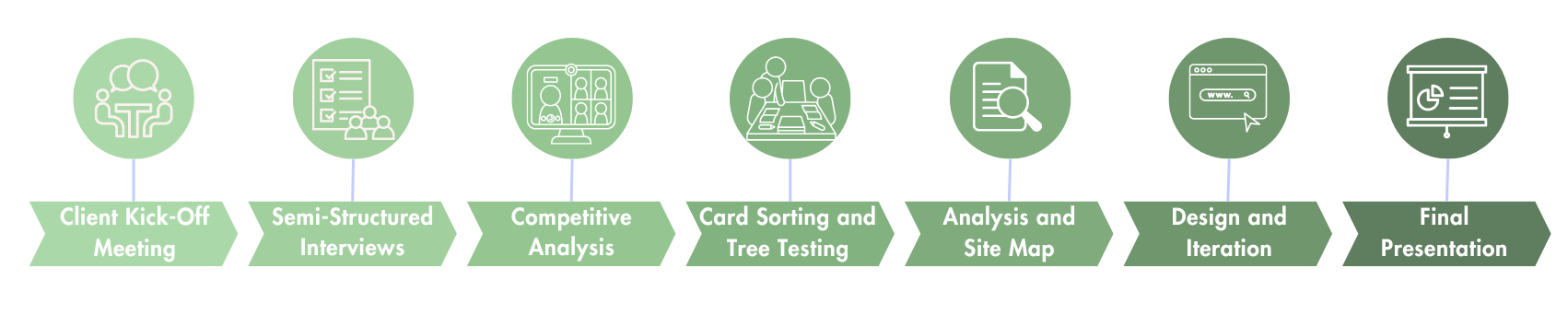
The Process
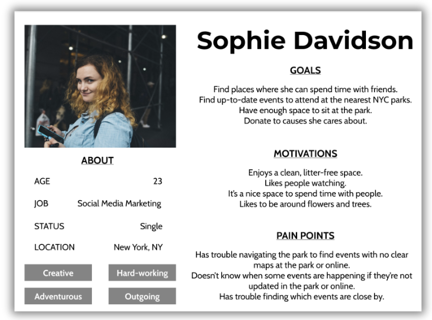
The User
After conducting semi-structured interviews with NYC parkgoers and park enthusiasts, we got a sense of the kind of user that would be going to a park website and what they would look for.
Sophie, on the right, is a user persona we created after our interviews.
Analyzing the Competition
Washington Square Park
Prospect Park Alliance

Habitat For Humanity

Environmental Defense Fund
Central Park Conservancy

Bronx Zoo

Ellis Island
Brooklyn Bridge Park
One-page donation forms increase credibility and keep users motivated to finish the action.
Donation pages with a default dollar amount selected are standard and may help users make decisions.
A monthly donation option should be available.
Showing events and maps on the home page creates easy access to desired information.
Font sizes and weights must be compliant with accessibility guidelines.
Card Sorting

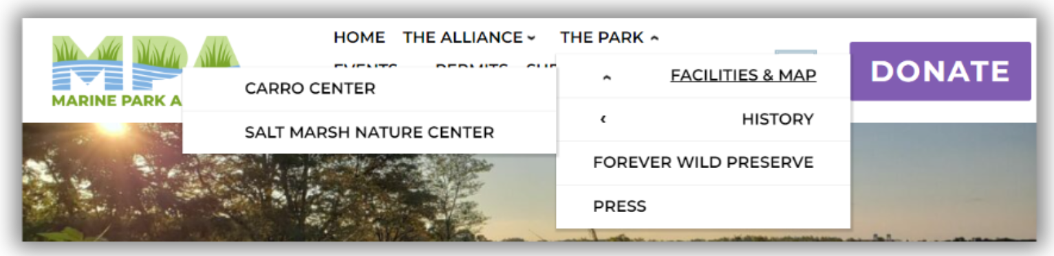
The original MPA website had confusing navigation tabs, like The Alliance vs. The Park.
There was also a lack of clarity on how to reach a desired location (for ex., Facilities & Map doesn't lead to a map).
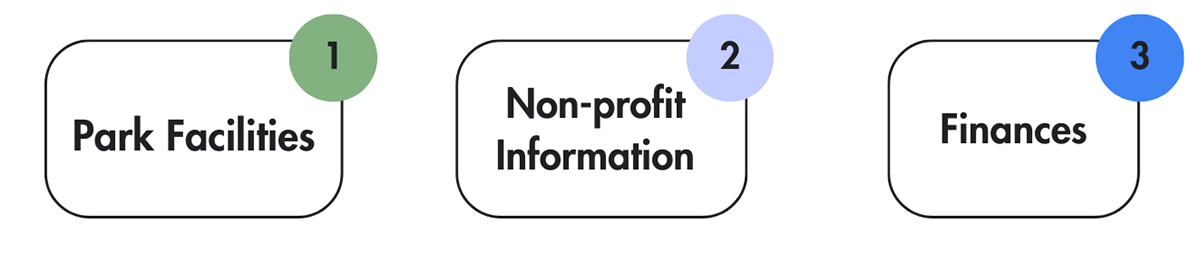
We decided to conduct card sorting with users to understand how they mentally categorize park information.
Users categorized cards into the following categories:
Tree Testing
We also conducted tree testing to test our proposed information architecture.
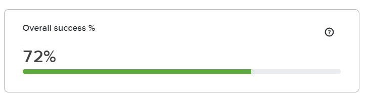
Tree testing showed us that most of our tabs were in the right place (bathrooms, hours, and donations).


Some of our tasks had lower success rates (Tasks 4 and 6 above) so we looked deeper at users' first clicks.
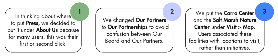
We then made the following decisions to iterate on the MPA site map:
Final Site Map
Our research informed our final site map that would allow users to better navigating the MPA website to donate and engage with the community.

Mid-Fi Prototyping
To meet MPA's main goal, we focused on the donation user flow on the desktop, where users are more likely to donate.
We also focused on the map user flow on mobile, where users are likely to use it when visiting the park.
Usability Testing
We conducted 10 moderated, in-person user tests to identify and fix pain points in our designs. The following changes were made:
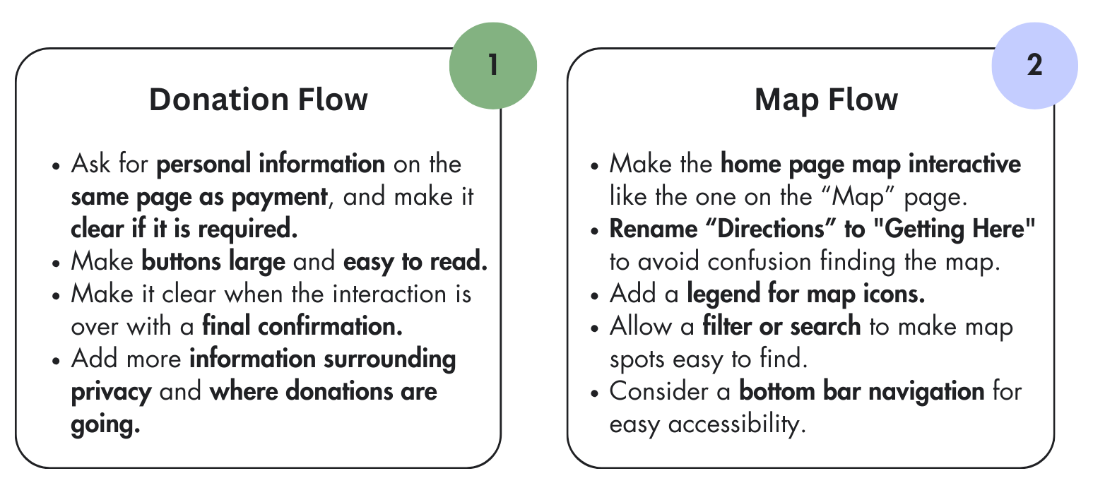
The Hi-Fi Prototype
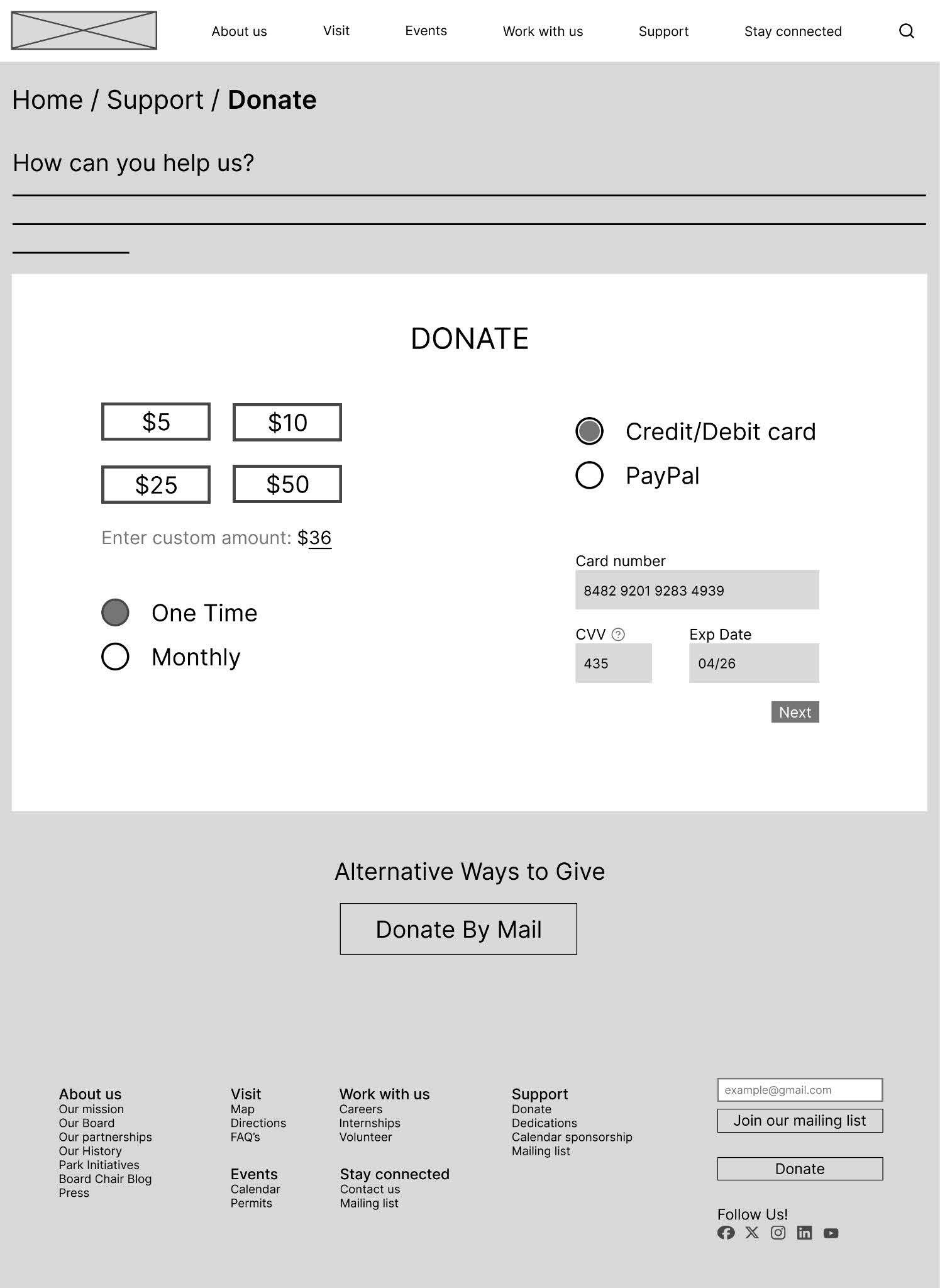
Donation Flow - Desktop
A short message above the donation form shows a user's impact if they donate to motivate them to continue.
The $10 default option is not something MPA previously had, but it is standard across competitor websites.
Donate and mailing list is on the footer for ease of access to important actions.
The payment form opens below the payment type selection to streamline the process, keep the user on the page, and maintain credibility.
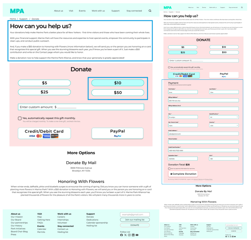
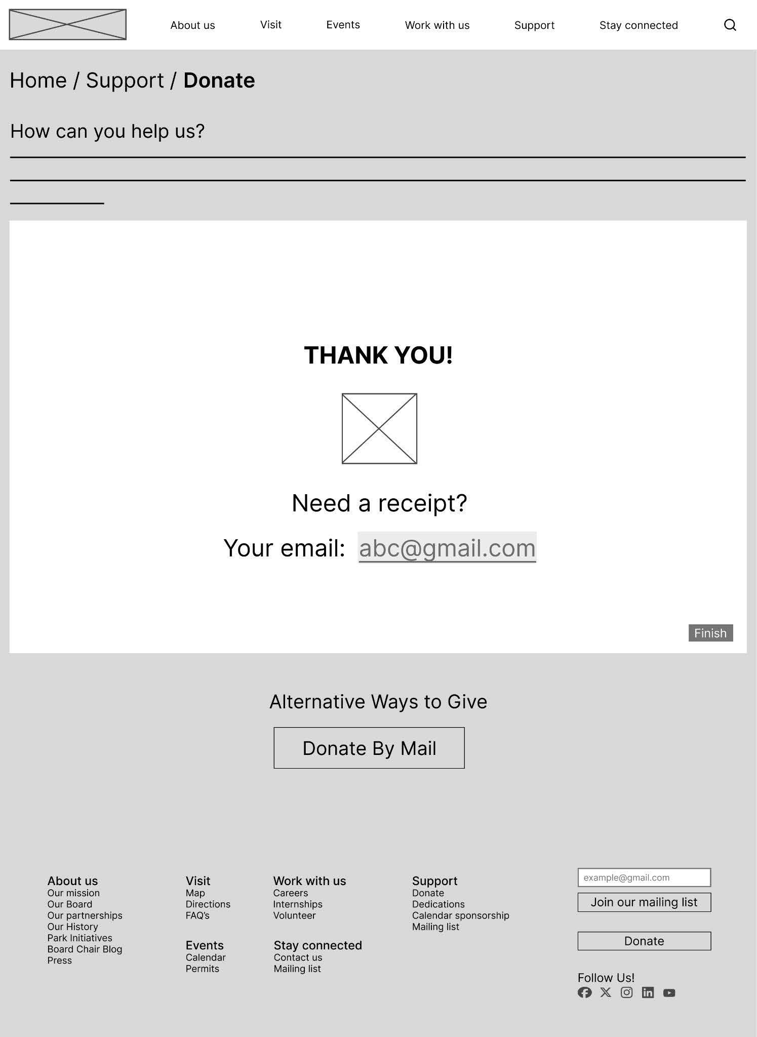
A pop-up with a final confirmation concludes the interaction.

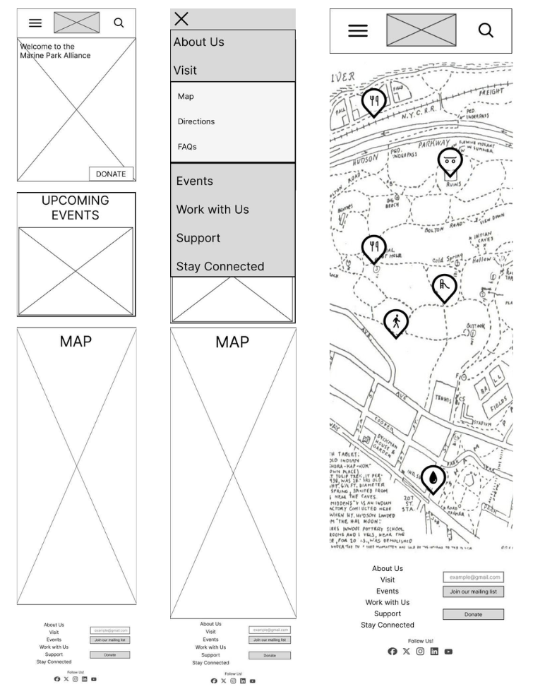
Map Flow - Mobile
On mobile, the upcoming events on the home page are in slider form to maximize mobile space.
The menu is on the bottom for ease of thumb accessibility for users. It expands up to reveal the navigation tabs.
To get to the map, the user clicks the hamburger menu, then Visit > Map.
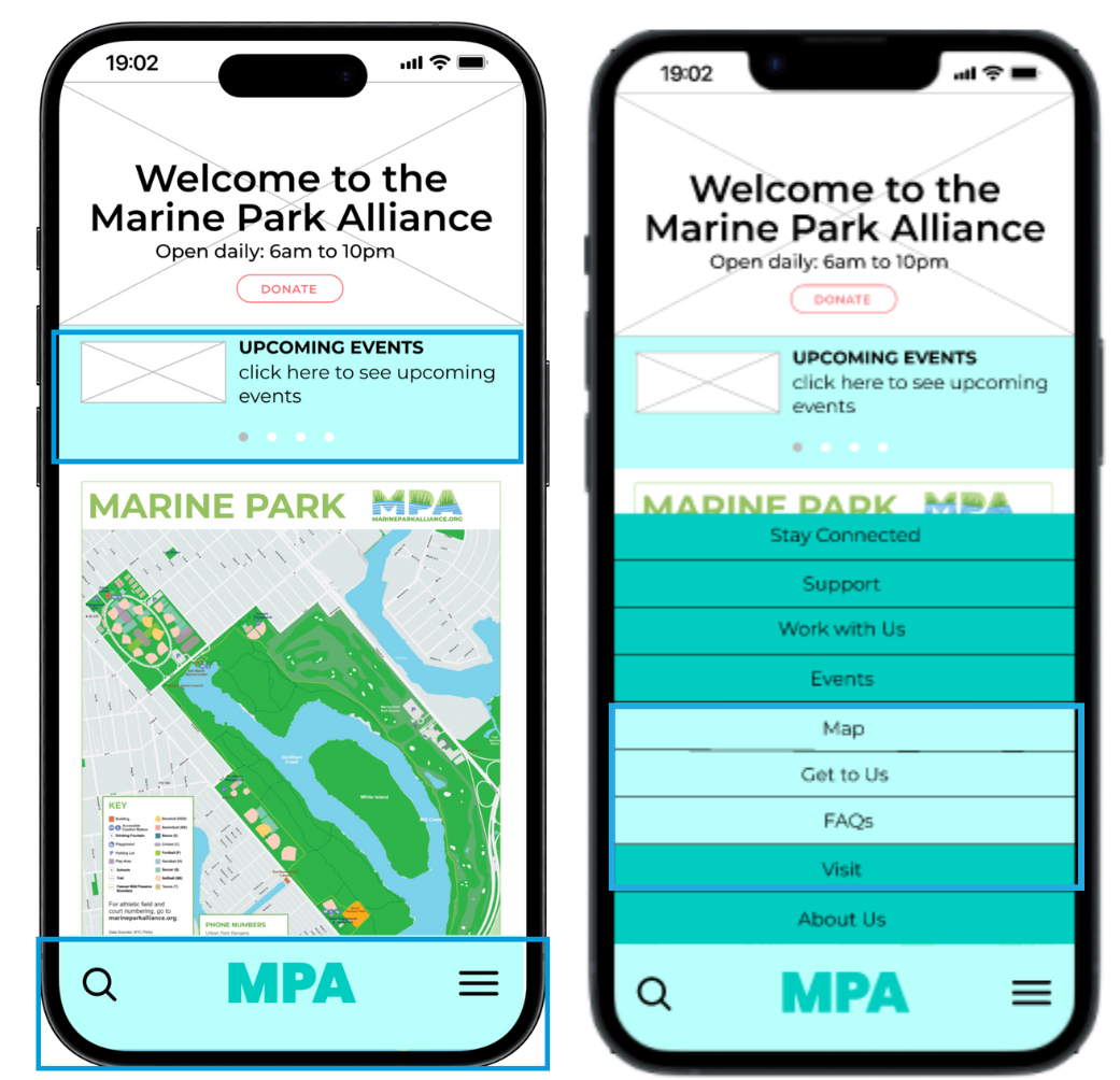
Map icons are in slider format on mobile.
When an icon is clicked, it turns white to indicate being selected. The icon also enlarges with an image of the playground and details (address, etc.).

Redesign Delivery
Client feedback
The mobile lower navigation was well-received as an accessibility feature, and brought out the question of whether the site map footer is necessary on mobile.
There was interest in distinguishing mobile navigation tabs in ways other than color, such as up and down arrows. The desktop site is easy to use, but donate buttons could be enlarged.
Future Considerations
1) An A/B test of distinguishing features in the mobile tabs - up and down arrows or font differences - would be helpful to understand accessibility and user preferences.
2) Remove the site map footer.
3) Enlarge the call-to-action buttons.
4) Measure impact by analyzing the number of donations completed since the launch of the redesigned website.
Thanks for going through my case study!